Overview
Veloura is a concept for a more considered ecommerce journey. Instead of asking shoppers to navigate an endless catalog, the experience uses taste signals, visual references and editorial curation to narrow the field into a collection that feels relevant. Every part of the journey, from the first recommendation to the final delivery update, is designed to preserve confidence and momentum.
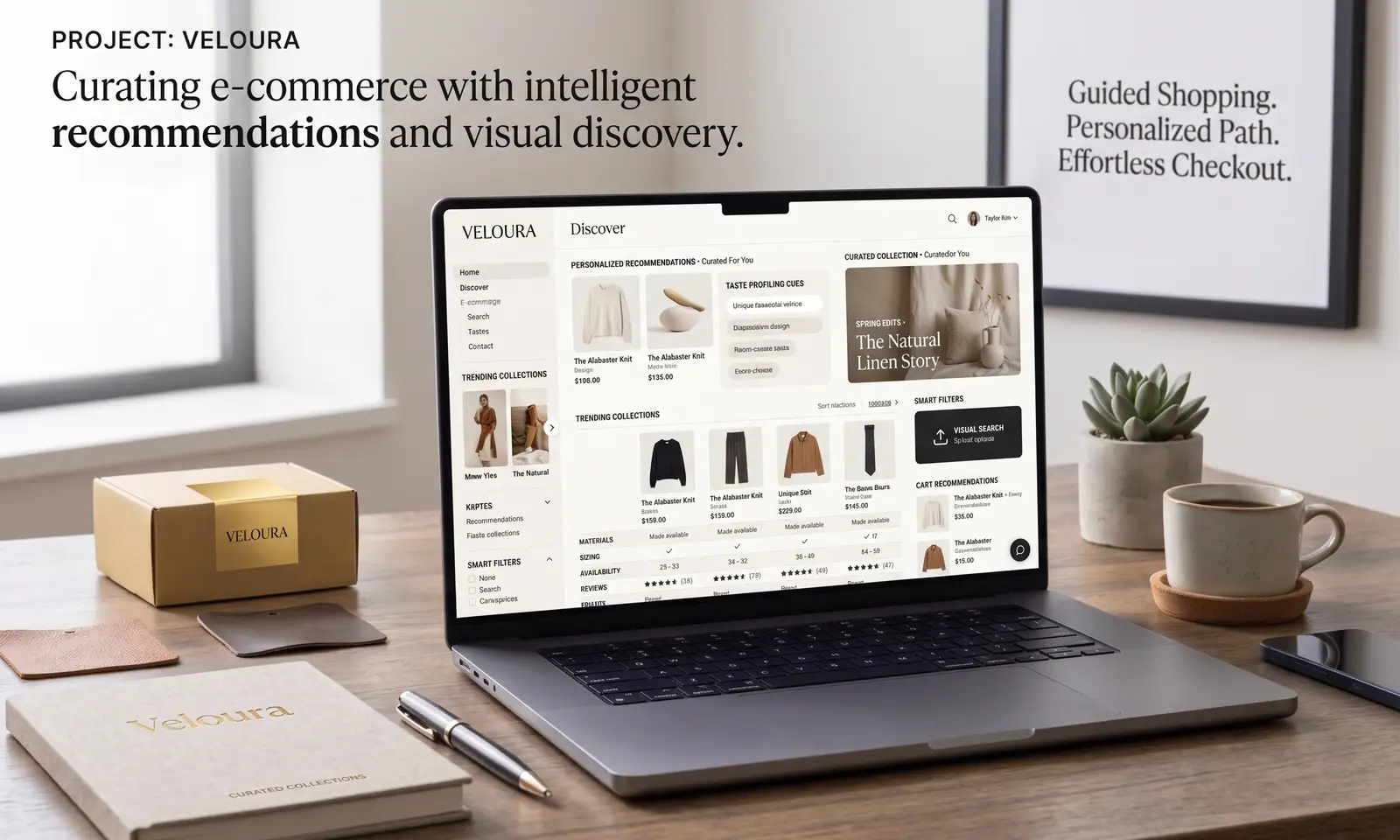
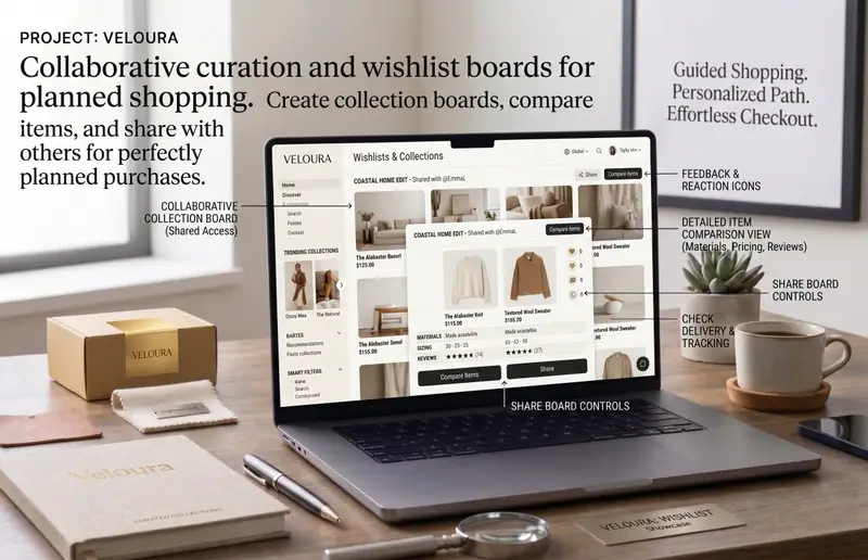
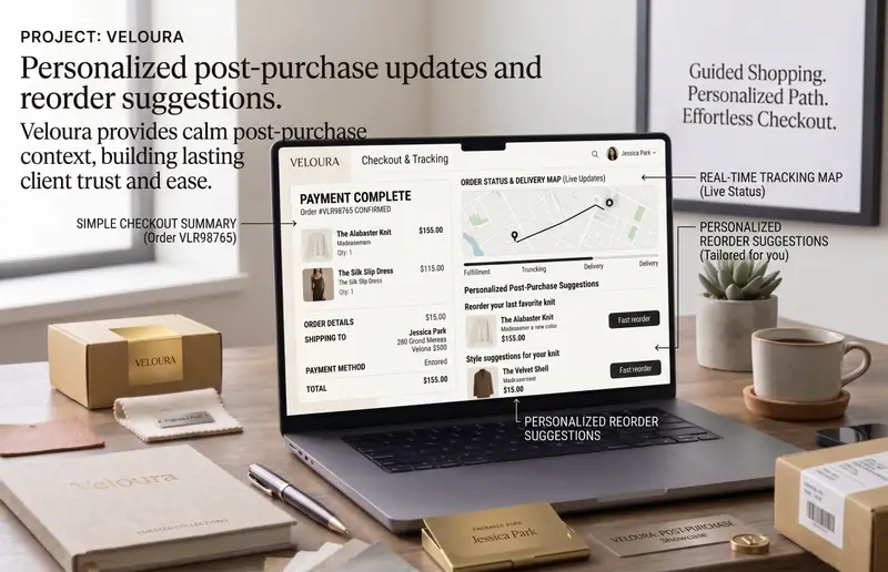
Explore Veloura's curated home, product discovery, saved collections and checkout flow. Interface concepts shown with illustrative data.
Challenge
Modern stores often have more inventory than shoppers have patience. Product discovery becomes repetitive, useful context is split across filters and reviews, and the checkout experience can undo the confidence built during browsing.
- Large catalogs made it difficult to find a distinctive product quickly.
- Recommendations felt generic because they ignored visual taste and context.
- Product comparison and checkout decisions happened in disconnected steps.
Solution
We shaped Veloura around guided discovery. The home experience learns from saved looks and browsing intent, while product pages combine clear detail with editorial context. The cart then keeps the same focus, surfacing useful complements and delivery information without adding friction.
- Personalized collections make the first screen feel immediately relevant.
- Visual search lets shoppers start from an image, color or silhouette they already love.
- Product pages balance material details, fit guidance, reviews and related looks.
- A compact checkout keeps address, payment and delivery choices in one clear flow.
Results
1
Connected
shopping journey3
Focused
checkout stages1:1
Personalized
discovery